CSS Animations 3D Creative and Unique CSS Transitions Animation With Examples

CSS Animations 3D Creative and Unique CSS Transitions Animation With Examples

Suraj (UI/UX Developer)
Aug 2024

CSS Animations: 3D Creative and Unique CSS Transitions Animation With Examples

In modern web design, CSS animations and transitions play a vital role in creating engaging, interactive, and visually appealing user experiences. From subtle hover effects to immersive 3D CSS animations, these techniques help websites feel dynamic without relying heavily on JavaScript.

In this blog, we’ll explore creative and unique CSS animations, understand the difference between transitions and animations, and look at 3D animation examples that can elevate your web design.

What Are CSS Animations?

CSS animations allow elements on a webpage to move, transform, or change styles smoothly over time. Unlike static designs, animations provide visual feedback, guide user attention, and improve usability.

CSS animations are mainly created using:

Transitions

Keyframe Animations

3D Transforms

CSS Transitions vs CSS Animations

CSS Transitions

CSS transitions control how smoothly a property changes from one value to another.

Key Features:

Simple to implement

Triggered by user actions (hover, focus, click)

Best for micro-interactions

CSS Animations

CSS animations use @keyframes to define multiple animation states.

Key Features:

Works automatically or on triggers

Allows complex motion sequences

Ideal for loaders, banners, and creative effects

Creative 3D CSS Animations

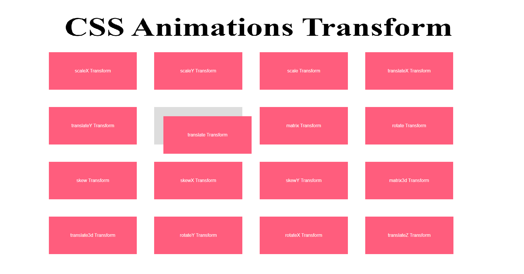
3D animations use CSS properties like:

transform

perspective

rotateX, rotateY, translateZ

These effects add depth and realism to UI components.

Best Practices for CSS Animations

Keep animations smooth and subtle

Avoid excessive motion that distracts users

Use transform and opacity for better performance

Test animations on mobile devices

Maintain accessibility (avoid flashing effects)

Why Use 3D CSS Animations?

Improves user experience
Enhances visual storytelling
Lightweight compared to JavaScript animations
Boosts engagement and time on site
Adds modern appeal to websites

Conclusion

CSS 3D animations and creative transitions are powerful tools for modern web development. Whether you’re designing a portfolio, business website, or landing page, well-implemented animations can make your site stand out while remaining fast and responsive.

By mastering CSS transitions, keyframes, and 3D transforms, you can create unique, interactive, and visually stunning web experiences—all with pure CSS.

HTML

<html lang="en">

<head>

<title>Code karne do | Animations</title>

<meta charset="utf-8">

<meta name="viewport" content="width=device-width, initial-scale=1, shrink-to-fit=no">

<link rel="stylesheet" type="text/css" href="css/style.css">

</head>

<body>

<h2 class="text-center">CSS Animations Transform</h2>

<div class="wrap">

<div class="ourbox">

<div class="bluecolor scaleX ">

scaleX Transform

</div>

</div>

<div class="ourbox">

<div class="bluecolor scaleY">

scaleY Transform

</div>

</div>

<div class="ourbox">

<div class="bluecolor scale">

scale Transform

</div>

</div>

<div class="ourbox">

<div class="bluecolor translateX">

translateX Transform

</div>

</div>

<div class="ourbox">

<div class="bluecolor translateY">

translateY Transform

</div>

</div>

<div class="ourbox">

<div class="bluecolor translate">

translate Transform

</div>

</div>

<div class="ourbox">

<div class="bluecolor matrix">

matrix Transform

</div>

</div>

<div class="ourbox">

<div class="bluecolor rotate">

rotate Transform

</div>

</div>

<div class="ourbox">

<div class="bluecolor skew">

skew Transform

</div>

</div>

<div class="ourbox">

<div class="bluecolor skewX">

skewX Transform

</div>

</div>

<div class="ourbox">

<div class="bluecolor skewY">

skewY Transform

</div>

</div>

<div class="ourbox">

<div class="bluecolor matrix3d">

matrix3d Transform

</div>

</div>

<div class="ourbox">

<div class="bluecolor translate3d">

translate3d Transform

</div>

</div>

<div class="ourbox">

<div class="bluecolor rotateY">

rotateY Transform

</div>

</div>

<div class="ourbox">

<div class="bluecolor rotateX">

rotateX Transform

</div>

</div>

<div class="ourbox">

<div class="bluecolor translateZ">

translateZ Transform

</div>

</div>

</div>

</body>


CSS

.text-center{text-align: center;}

.wrap {

margin: 50px auto;

max-width: 80%;

width: 80%;

display: flex;

flex-flow: row wrap;

justify-content: center;

font-family: sans-serif;

}

.ourbox {

width: calc(20%);

margin:30px;

background: #ddd;

cursor: pointer;

color: #FFF;

text-align: center;

line-height: 130px;

}

.bluecolor {

background-color: #ff5d7d;

}

.scaleX {

transform: scaleX(1);

transition: transform 0.7s ease;

}

.ourbox:hover .scaleX {

transform: scaleX(2);

}

.scaleY {

transform: scaleY(1);

transition: transform 0.7s ease;

}

.ourbox:hover .scaleY {

transform: scaleY(2);

}

.scale {

transform: scale(1, 1);

transition: transform 0.7s ease;

}

.ourbox:hover .scale {

transform: scale(1.5, 1.5);

}

.translateX {

transform: translateX(1);

transition: transform 0.7s ease;

}

.ourbox:hover .translateX {

transform: translateX(2em);

}

.translateY {

transform: translateY(1);

transition: transform 0.7s ease;

}

.ourbox:hover .translateY {

transform: translateY(2em);

}

.translate {

transform: translate(1, 1);

transition: transform 0.7s ease;

}

.ourbox:hover .translate {

transform: translate(2em, 2em);

}

.matrix {

transform: matrix(1, 1, 1, 1);

transition: transform 0.7s ease;

}

.ourbox:hover .matrix {

transform: matrix(1, -1, 0, 1, 0, 0);

/* Standard syntax */

}

.rotate {

transform: rotate(0);

transition: transform 0.7s ease;

}

.ourbox:hover .rotate {

transform: rotate(270deg);

/* Standard syntax */

}

.skew {

transform: skew(1, 1);

transition: transform 0.7s ease;

}

.ourbox:hover .skew {

transform: skew(30deg, 20deg);

/* Standard syntax */

}

.skewX {

transform: skewX(1);

transition: transform 0.7s ease;

}

.ourbox:hover .skewX {

transform: skewX(30deg);

/* Standard syntax */

}

.skewY {

transform: skewY(1);

transition: transform 0.7s ease;

}

.ourbox:hover .skewY {

transform: skewY(30deg);

/* Standard syntax */

}

.matrix3d {

transform: matrix3d(1);

transition: transform 0.7s ease;

}

.ourbox:hover .matrix3d {

transform: matrix3d(0.8535533905932737, 0.4999999999999999, 0.14644660940672619, 0, -0.4999999999999999, 0.7071067811865476, 0.4999999999999999, 0, 0.14644660940672619, -0.4999999999999999, 0.8535533905932737, 0, 22.62994231491119, -20.3223304703363, 101.3700576850888, 1)

/* Standard syntax */

}

.translate3d {

transform: translate3d(1px, 1px, 1);

transition: transform 0.7s ease;

}

.ourbox:hover .translate3d {

transform: translate3d(1px, 1px, 50px) rotate3d(3, 2, 2, 90deg);

/* Standard syntax */

}

.rotateY {

transform: perspective(1) scaleZ(1) rotateY(0deg);

transition: transform 0.7s ease;

/* perspective: 300px; */

/* transform-style: preserve-3d; */

}

.ourbox:hover .rotateY {

/* transform: translate3d(42px, 42px, 42px); */

transform: perspective(500px) scaleZ(2) rotateY(45deg);

/* Standard syntax */

}

.rotateX {

/* perspective: 100px; */

transform: perspective(1) scaleZ(1) rotateX(0deg);

transition: transform 0.7s ease;

}

.ourbox:hover .rotateX {

transform: perspective(500px) scaleZ(2) rotateX(45deg);

/* Standard syntax */

}

.translateZ {

transform: translateZ(1px);

transition: transform 0.7s ease;

}

.ourbox:hover .translateZ {

transform: rotate3d(3, 2, 2, 90deg) translateZ(50px);

/* Standard syntax */

}