How to Create Mobile Responsive Service Box with Html and Css

How to Create Mobile Responsive Service Box with Html and Css

Suraj (UI/UX Developer)
Jun 2024

How to Create Mobile Responsive Service Box with HTML and CSS

In modern web design, mobile responsiveness is no longer optional—it’s a necessity. One of the most commonly used UI components on websites is a service box, used to showcase services, features, or offerings in a visually appealing way.

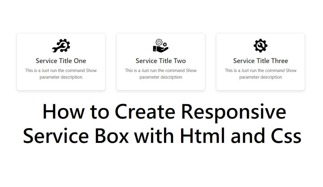
In this tutorial, you’ll learn how to create a mobile responsive service box using only HTML and CSS, without any frameworks. This layout will automatically adjust for desktops, tablets, and mobile devices.

Why Use a Responsive Service Box?

A responsive service box helps you:

Improve user experience on mobile devices

Increase engagement and readability

Make your website look professional and modern

Boost SEO and page performance

Key Features of Our Service Box Design

Fully mobile responsive

Clean and modern UI

Easy to customize

No JavaScript required

Lightweight and fast loading

How This Responsive Design Works

Desktop: Service boxes appear in a row

Tablet & Mobile: Service boxes stack vertically

Flexible Width: Automatically adjusts to screen size

Smooth Hover Effects: Enhance user interaction

Best Practices for Responsive Service Boxes

Always use the viewport meta tag

Prefer Flexbox or CSS Grid

Avoid fixed widths

Keep content concise

Test on multiple devices

Conclusion

Creating a mobile responsive service box with HTML and CSS is simple and highly effective for modern websites. By using Flexbox and media queries, you can design layouts that look great on all screen sizes without relying on heavy frameworks.

This approach improves user experience, performance, and SEO, making it ideal for portfolios, business websites, and landing pages.

HTML

<div class="service-box-main">

<div class="service-box">

<div class="service-icon">

<img src="https://encrypted-tbn0.gstatic.com/images?q=tbn:ANd9GcR59sGbVDT-_-pWIaVj0-ji-9_komt9IkFPgw&s" alt="Service Icon">

</div>

<div class="service-content">

<h3 class="service-title">Service Title One</h3>

<p class="service-description">This is a Just run the command Show parameter description</p>

</div>

</div>

<div class="service-box">

<div class="service-icon">

<img src="https://encrypted-tbn0.gstatic.com/images?q=tbn:ANd9GcTeujOaRWnmiTkG15-RkZrieVZ_JKumVf1CPQ&s" alt="Service Icon">

</div>

<div class="service-content">

<h3 class="service-title">Service Title Two</h3>

<p class="service-description">This is a Just run the command Show parameter description</p>

</div>

</div>

<div class="service-box">

<div class="service-icon">

<img src="https://cdn-icons-png.flaticon.com/512/75/75668.png" alt="Service Icon">

</div>

<div class="service-content">

<h3 class="service-title">Service Title Three</h3>

<p class="service-description">This is a Just run the command Show parameter description</p>

</div>

</div>

</div>

CSS

.service-box-main{width: 80%;margin: auto;justify-content: center;display: flex;}

.service-box {

border: 1px solid #e0e0e0;

border-radius: 8px;

padding: 20px;

width: 33.33%;

margin: 20px;

text-align: center;

box-shadow: 0 4px 8px rgba(0, 0, 0, 0.1);

transition: transform 0.3s, box-shadow 0.3s;

}

/* Icon container */

.service-icon {

margin-bottom: 15px;

}

/* Icon image */

.service-icon img {

object-fit: scale-down;

height: 50px;

}

/* Service title */

.service-title {

font-size: 1.5em;

margin: 10px 0;

color: #333;

}

/* Service description */

.service-description {

font-size: 1em;

color: #666;

}

/* Hover effect */

.service-box:hover {

transform: translateY(-5px);

box-shadow: 0 8px 16px rgba(0, 0, 0, 0.2);

}

/*Mobile Responsive*/

@media only screen and (max-width: 767px) {

.service-box-main {

width: 100%;

margin: auto;

justify-content: center;

display: block;

}

.service-box-main{width: 98%;

}

/*end mobile responsive*/