How to Create Responsive Footer Using html and Css

How to Create Responsive Footer Using html and Css

Suraj (UI/UX Developer)
Jun 2024

How to Create a Responsive Footer Using HTML and CSS

A footer is an essential part of any website. It usually contains important information like navigation links, contact details, social media icons, and copyright text. A responsive footer ensures that your website looks clean and professional on all screen sizes, including mobiles, tablets, and desktops.

In this blog, you’ll learn how to create a responsive footer using HTML and CSS step by step.

Why a Responsive Footer Is Important

A responsive footer improves both user experience and SEO. When your footer adapts smoothly to different screen sizes, visitors can easily access important links without zooming or scrolling unnecessarily.

Benefits of a Responsive Footer:

Works perfectly on mobile and desktop

Improves website usability

Enhances website design consistency

Helps with SEO and accessibility

Looks professional and modern

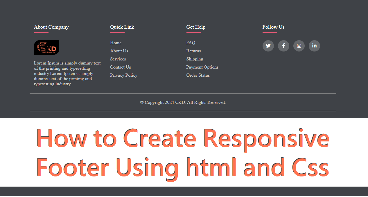
Basic Structure of a Footer in HTML

The HTML structure of a footer should be clean and semantic. Using proper tags helps search engines understand your website better.

Common sections in a footer include:

About section

Quick links

Contact information

Social media links

Copyright text

HTML provides the <footer> tag, which is specifically designed for this purpose.

Styling the Footer Using CSS

CSS is used to design and arrange footer elements. Modern layouts use Flexbox or CSS Grid to make the footer responsive.

Key styling techniques:

Flexbox for layout alignment

Media queries for responsiveness

Padding and margins for spacing

Background colors and typography for readability

Making the Footer Responsive

Responsiveness is achieved by adjusting the layout based on screen size.

Important Techniques:

Use display: flex with flex-wrap

Stack footer sections vertically on small screens

Adjust font size and spacing for mobile devices

Use percentage widths instead of fixed values

Example: Responsive Footer Layout (Concept)

A typical responsive footer layout:

Desktop view: 3–4 columns aligned horizontally

Tablet view: 2 columns per row

Mobile view: All sections stacked vertically

This approach ensures the footer looks balanced on all devices.

Best Practices for Responsive Footers

Keep content minimal and useful

Use readable font sizes

Avoid overcrowding links

Make social icons touch-friendly

Test footer on different screen sizes

Common Mistakes to Avoid

Using fixed widths

Ignoring mobile users

Poor color contrast

Too many links in one section

Not using semantic HTML tags

Final Thoughts

Creating a responsive footer using HTML and CSS is simple when you follow a structured approach. A well-designed footer improves website navigation, boosts user engagement, and strengthens your overall site design. By using Flexbox, media queries, and clean HTML structure, you can build a footer that looks great on any device.

HTML

<footer class="footer">

<div class="container-custome">

<div class="row-custome">

<div class="footer-col-custome">

<h5>About Company</h5>

<img src="https://codekarnedo.com/malinLogo.png" class="logo" height="40">

<p class="text-white">Lorem Ipsum is simply dummy text of the printing and typesetting industry.Lorem Ipsum is simply dummy text of the printing and typesetting industry.</p>

</div>

<div class="footer-col-custome">

<h5>Quick Link</h5>

<ul class="ul-custome">

<li><a href="#">Home</a></li>

<li><a href="#">About Us</a></li>

<li><a href="#">Services</a></li>

<li><a href="#">Contact Us</a></li>

<li><a href="#">Privacy policy</a></li>

</ul>

</div>

<div class="footer-col-custome">

<h5>Get help</h5>

<ul class="ul-custome">

<li><a href="#">FAQ</a></li>

<li><a href="#">Returns</a></li>

<li><a href="#">Shipping</a></li>

<li><a href="#">Payment options</a></li>

<li><a href="#">Order status</a></li>

</ul>

</div>

<div class="footer-col-custome">

<h5>Follow us</h5>

<div class="social-links">

<a href="#"><i class="fab fa-twitter"></i></a>

<a href="#"><i class="fab fa-facebook-f"></i></a>

<a href="#"><i class="fab fa-instagram"></i></a>

<a href="#"><i class="fab fa-linkedin-in"></i></a>

</div>

</div>

</div>

<hr />

<div class="footer-end">© Copyright 2024 CKD. All Rights Reserved. </div>

<hr />

</div>

</footer>

CSS

.container-custome {

width: 95%;

margin: auto;

}

.row-custome {

display: flex;

flex-wrap: wrap;

}

.logo {

background-color: #000;

padding: 5px 10px;

box-shadow: 0 0 1px #000;

border-radius: 20px 0;

}

ul.ul-custome li {

color: #fff;

list-style-type: none;

margin-left: -40px;

}

.footer {

background-color: #3f4247;

padding: 15px;

}

.footer-col-custome {

width: 22%;

padding: 0 15px;

}

.footer-col-custome h5 {

font-size: 18px;

color: #fff;

text-transform: capitalize;

margin-bottom: 35px;

font-weight: 500;

position: relative;

}

.footer-col-custome h5::before {

content: "";

position: absolute;

left: 0;

bottom: -10px;

background-color: #ff5d7d;

height: 2px;

box-sizing: border-box;

width: 50px;

}

.footer-col-custome ul li:not(:last-child) {

margin-bottom: 10px;

}

.footer-col-custome ul li a {

font-size: 16px;

text-transform: capitalize;

text-decoration: none;

font-weight: 300;

color: #ccc;

display: block;

transition: 0.2s;

}

.footer-col-custome ul li a:hover {

color: #fff;

padding-left: 8px;

}

.footer-col-custome .social-links a {

display: inline-block;

height: 39px;

width: 39px;

background-color: rgba(255, 255, 255, 0.2);

margin: 0 10px 10px 0;

text-align: center;

line-height: 40px;

border-radius: 50%;

rotate: 360deg;

color: #fff;

transition: 0.5s;

}

.footer-col-custome .social-links a:hover {

color: #24262b;

background-color: #fff;

rotate: 0deg;

}

.text-white {

color: #ccc;

}

.footer-end {

color: #ccc;

font-size: 16px;

text-align: center;

margin-top: 20px;

margin-bottom: 20px;

}

@media only screen and (max-width: 767px) {

.footer-col-custome {

width: 100%;

margin-bottom: 30px;

}

.container-custome {

width: 100%;

margin: auto;

}

}