Create Mobile Responsive Navbar using Html and Css

Create Mobile Responsive Navbar using Html and Css

Suraj (UI/UX Developer)
Jun 2024

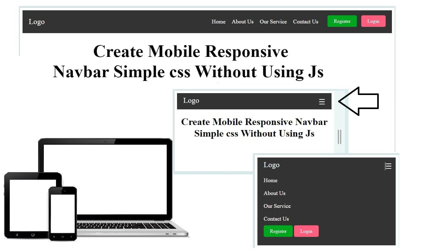
Create Mobile Responsive Navbar Using HTML and CSS

In today’s mobile-first world, a website that doesn’t adapt to different screen sizes risks losing users instantly. One of the most important UI elements that must be responsive is the navigation bar. A mobile responsive navbar ensures smooth navigation on desktops, tablets, and smartphones—without breaking the layout or user experience.

In this blog, you’ll learn how to create a mobile responsive navbar using only HTML and CSS, without relying on JavaScript or external frameworks.

Why a Mobile Responsive Navbar Is Important

A responsive navbar automatically adjusts based on screen size. On large screens, it shows menu items horizontally, while on smaller screens, it transforms into a compact menu (often a hamburger icon).

Benefits of a Responsive Navbar:

Improves user experience on mobile devices

Helps with SEO and Google mobile-friendly ranking

Reduces bounce rate

Looks clean and professional on all devices

Basic Structure of a Responsive Navbar

To create a responsive navbar, we mainly use:

HTML for structure

CSS Flexbox for layout

CSS Media Queries for responsiveness

The idea is simple:

Show a horizontal menu on desktop

Hide the menu and show a toggle icon on mobile

How This Responsive Navbar Works

On desktop screens, the menu items appear in a row

On screens smaller than 768px, the menu hides automatically

A hamburger icon appears on mobile

Clicking the icon toggles the menu using pure CSS

This approach is lightweight, fast, and beginner-friendly.

Best Practices for Responsive Navbars

Always use the viewport meta tag

Keep menu items minimal on mobile

Use readable font sizes and enough spacing

Test on real devices and different browsers

Final Thoughts

Creating a mobile responsive navbar using HTML and CSS is an essential skill for every web developer. With Flexbox and media queries, you can build clean, fast, and user-friendly navigation without JavaScript.

This method is perfect for:

Portfolio websites

Blogs

Business websites

Landing pages

HTML

<!DOCTYPE html>

<html lang="en">

<head>

<meta charset="UTF-8">

<meta name="viewport" content="width=device-width, initial-scale=1.0">

<title>Responsive Navbar CKD</title>

<link rel="stylesheet" href="css/style.css">

</head>

<body>

<nav class="navbar">

<div class="navbar-container">

<a href="#" class="logo">Logo</a>

<input type="checkbox" id="menu-toggle">

<label for="menu-toggle" class="menu-icon">&#9776;</label>

<ul class="nav-menu">

<li class="nav-item"><a href="#" class="nav-link">Home</a></li>

<li class="nav-item"><a href="#" class="nav-link">About Us</a></li>

<li class="nav-item"><a href="#" class="nav-link">Our Service</a></li>

<li class="nav-item"><a href="#" class="nav-link">Contact Us</a></li>

<li class="nav-item auth-buttons">

<a href="#" class="btn register">Register</a>

<a href="#" class="btn login">Login</a>

</li>

</ul>

</div>

</nav>

<h1 class="text-center">Create Mobile Responsive Navbar Simple css Without Using Js</h1>

</body>

</html>

CSS

.navbar {

background-color: #333;

color: #fff;

padding: 10px 20px;

position: relative;

}

.navbar-container {

display: flex;

justify-content: space-between;

align-items: center;

}

.logo {

font-size: 24px;

color: #fff;

text-decoration: none;

}

#menu-toggle {

display: none;

}

.menu-icon {

display: none;

font-size: 24px;

cursor: pointer;

}

.nav-menu {

list-style: none;

display: flex;

}

.nav-item {

margin-left: 20px;

}

.nav-link {

color: #fff;

text-decoration: none;

font-size: 18px;

}

.nav-link:hover {

text-decoration: underline;

}

.auth-buttons .btn {

color: #fff;

text-decoration: none;

padding: 10px 20px;

margin-left: 10px;

border: 1px solid #fff;

border-radius: 5px;

transition: background-color 0.3s;

}

.btn.login {

background-color: #ff5d7d; /* Green */

border: none;

}

.btn.register {

background-color: #00a61d; /* Blue */

border: none;

}

.btn:hover {

background-color: #555;

border-color: #555;

}

/* Responsive Mobile Css*/

.text-center{text-align: center;}

@media (max-width: 768px) {

.navbar-container {

flex-direction: column;

align-items: flex-start;

}

.menu-icon {

display: block;

position: absolute;

right: 12px;

}

.nav-menu {

display: none;

flex-direction: column;

width: 100%;

}

.nav-menu.active {

display: flex;

}

.nav-item {

margin: 10px 0;

}

.auth-buttons .btn {

margin: 10px 0;

}

}

#menu-toggle:checked + .menu-icon + .nav-menu {

display: flex;

padding: 0px;

}