
Creating a responsive image box using CSS is an essential skill for modern web developers. Whether you are designing a portfolio, blog, eCommerce website, or landing page, responsive image boxes help maintain visual consistency across all screen sizes. With the right use of CSS properties like flex, grid, object-fit, and media queries, you can create elegant image boxes without relying on heavy JavaScript libraries.
In this blog, we’ll explore how CSS alone can be used to create flexible and responsive image boxes that adapt beautifully on mobile, tablet, and desktop screens.
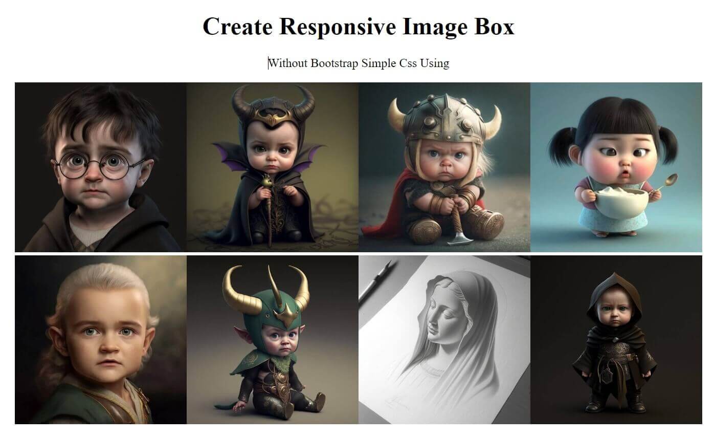
What Is a Responsive Image Box?
A responsive image box is a container that holds an image and automatically adjusts its size, aspect ratio, and layout based on the device screen. The goal is to prevent image distortion, overflow, or layout breakage while maintaining performance and aesthetics.
Why Use CSS for Responsive Image Boxes?
Using CSS for responsive image boxes offers several advantages:
Faster page load time
No dependency on JavaScript
Easy maintenance and scalability
Better SEO and accessibility
Clean and modern layout control
Common Use Cases
Responsive image boxes are widely used in:
Portfolio galleries
Product listings
Blog thumbnails
Team member cards
Real estate property showcases
Best Practices
Always use optimized images (WebP recommended)
Avoid fixed heights when possible
Use object-fit: cover for clean layouts
Test across multiple screen sizes
Keep CSS minimal for performance
Conclusion
Learning how to create a responsive image box using CSS improves both design quality and user experience. With modern CSS features like Flexbox, Grid, and object-fit, you can build lightweight and scalable image layouts that work flawlessly on any device. Mastering this technique is a must for every front-end developer aiming to build responsive, SEO-friendly websites.