
<!DOCTYPE html>
<html lang="en">
<head>
<meta charset="UTF-8">
<meta name="viewport" content="width=device-width, initial-scale=1.0">
<title>Responsive Hero Section</title>
<link rel="stylesheet" href="css/style.css">
</head>
<body>
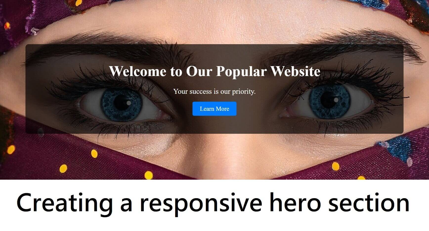
<section class="hero">
<div class="hero-content">
<h1>Welcome to Our Popular Website</h1>
<p>Your success is our priority.</p>
<a href="#about" class="cta-button">Learn More</a>
</div>
</section>
</body>
</html>
/* Make the hero section fill the viewport */
.hero {
display: flex;
align-items: center;
justify-content: center;
height: 70vh;
background: url('../image/walpapper.jpg') no-repeat center center/cover;
color: white;
text-align: center;
padding: 0 20px;
}
/* Style the hero content */
.hero-content {
width: 80%;
background: #000000ab;
padding: 20px;
min-height: 250px;
border-radius: 10px;
}
/* Headings and paragraphs */
.hero-content h1 {
font-size: 3rem;
color: #fff;
margin-bottom: 1rem;
}
.hero-content p {
font-size: 1.5rem;
color: #fff;
margin-bottom: 2rem;
}
/* Call-to-action button */
.cta-button {
padding: 0.75rem 1.5rem;
background-color: #007BFF;
color: white;
text-decoration: none;
font-size: 1.25rem;
border-radius: 5px;
transition: background-color 0.3s ease;
}
.cta-button:hover {
background-color: #0056b3;
}
/* Responsive adjustments */
@media (max-width: 768px) {
.hero-content {
width: 95%;}
.hero {height: 90vh;background-position-x: -286px;}
.hero-content h1 {
font-size: 3rem;
}
.hero-content p {
font-size: 2rem;
}
.cta-button {
font-size: 1rem;
padding: 0.5rem 1rem;
}
}
@media (max-width: 480px) {
.hero-content h1 {
font-size: 3rem;
}
.hero-content p {
font-size: 2rem;
}
.cta-button {
font-size: 0.875rem;
padding: 0.5rem 1rem;
}
}