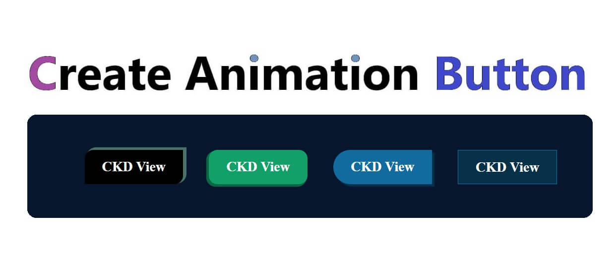
How Create Animate Buttons With CSS Js

How Create Animate Buttons With CSS Js

Suraj (UI/UX Developer)
Jul 2024
HTML

<!DOCTYPE html>
<html>
<head>
<meta charset="utf-8">
<meta name="viewport" content="width=device-width, initial-scale=1">
<title>CKD | Button Animation</title>
<link rel="stylesheet" href="css/style.css">
</head>
<body>
<h2 class="page_title">New Button With Animations</h2>
<div class="wrap-safe">
 <a href="#" class="mykaka safe-a">CKD View</a>
 <a href="#" class="mykaka safe-b">CKD View</a>
 <a href="#" class="mykaka safe-c">CKD View</a>
 <a href="#" class="mykaka safe-d">CKD View</a>
</div>
</body>
</html>
 

CSS

.wrap-safe{
 max-width:800px;
 margin:40px auto;
 padding:30px;
 background:#07162d;
 border-radius:25px;
 display:flex;
 flex-wrap:wrap;
 gap:30px;
 justify-content:center;
}
.page_title{text-align: center;}
a.mykaka.safe-a {
   background: #000000;
   padding: 10px 20px;
   text-decoration: none;
   font-weight: 900;
   border-radius: 10px 0px;
   color: #fff;
   box-shadow: 3px -2px 0px 1px #477368;
   transition: .3s;
}
a.mykaka.safe-b {
   background: #129f68;
   padding: 10px 20px;
   text-decoration: none;
   font-weight: 900;
   border-radius: 10px;
   color: #fff;
   box-shadow: -2px 2px 0px 1px #096843;
   transition: .3s;
}
a.mykaka.safe-c {
   background: #126b9f;
   padding: 10px 20px;
   text-decoration: none;
   font-weight: 900;
   border-radius: 20px 0px 0px 20px;
   color: #fff;
   box-shadow: 3px 3px 1px 0px #063149;
   transition: .3s;
}
a.mykaka.safe-d {
   background: #126b9f;
   padding: 10px 20px;
   text-decoration: none;
   font-weight: 900;
   border: 1px solid #0674b1;
   border-radius: 0px;
   color: #fff;
   box-shadow: 3px 3px 0px 20px #063149 inset;
   transition: .3s;
}
a.mykaka:hover.safe-a {
       background: #010708;
   padding: 10px 20px;
   text-decoration: none;
   font-weight: 900;
   border-radius: 10px 0px;
   color: #fff;
       box-shadow: -3px 2px 0px 1px #477368;
   transition: .3s;
}
a.mykaka:hover.safe-b {
       background: #14b576;
   padding: 10px 20px;
   text-decoration: none;
   font-weight: 900;
   border-radius: 10px;
   color: #fff;
   box-shadow: -4px -4px 0px 0px #0b794e;
   transition: .3s;
}
a.mykaka:hover.safe-c {
      background: #1171a8;
   padding: 10px 20px;
   text-decoration: none;
   font-weight: 900;
   border-radius: 20px 0px 0px 20px;
   color: #fff;
       box-shadow: -3px 0px 1px 3px #0a4465;
   transition: .3s;
}
a.mykaka:hover.safe-d {
   background: #1a82be;
   padding: 10px 20px;
   text-decoration: none;
   font-weight: 900;
   border: 1px solid #1da5f1;
   border-radius: 0px;
   color: #fff;
   box-shadow: 0px 0px 0px 0px #1470a3 inset;
   transition: .3s;
}