
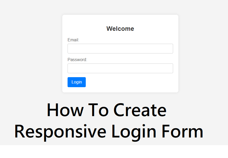
How To Create a Responsive Login Form Using HTML & CSS
In today’s digital world, users access websites from multiple devices such as mobiles, tablets, and desktops. A responsive login form ensures a smooth user experience across all screen sizes. In this blog, you’ll learn how to create a responsive login form using HTML and CSS, following modern web design best practices.
Whether you’re a beginner or an aspiring front-end developer, this guide will help you build a clean, mobile-friendly login form step by step.
What Is a Responsive Login Form?
A responsive login form automatically adjusts its layout, width, and alignment according to the screen size. It provides:
Easy readability on small screens
Proper spacing and alignment
Touch-friendly input fields
Faster user interaction
Responsive design is essential for usability, SEO, and user retention.
Tools Required
You only need basic web technologies:
HTML5 – for structure
CSS3 – for styling and responsiveness
Media Queries – to adapt design for different screen sizes
Best Practices for Responsive Login Forms
Use flexbox or CSS grid for alignment
Keep input fields large for touch screens
Avoid fixed widths; use percentages or max-width
Use readable font sizes
Maintain proper contrast for accessibility
Benefits of Responsive Login Forms
Better mobile user experience
Higher engagement and conversions
Improved website SEO
Professional and modern UI
Conclusion
Creating a responsive login form is simple when you use clean HTML, modern CSS, and media queries. A well-designed login form not only improves user experience but also adds professionalism to your website.
By following this guide, you can easily create a responsive login form that works smoothly on all devices.