Modern Responsive Bootstrap Card Design

Modern Responsive Bootstrap Card Design

Suraj (UI/UX Developer)
Dec 2025

Modern Responsive Bootstrap Card Design: A Complete Guide for 2026

In today’s digital-first world, website design plays a crucial role in user engagement and conversion. One of the most effective UI components used in modern web design is the Bootstrap card. A modern responsive Bootstrap card design helps developers present content in a clean, structured, and mobile-friendly way across all screen sizes.

Bootstrap cards are flexible content containers that can include text, images, buttons, icons, and links—making them ideal for portfolios, product listings, blogs, dashboards, and business websites.

What Is a Bootstrap Card?

A Bootstrap card is a lightweight, extensible content container introduced in Bootstrap 4 and improved further in Bootstrap 5. It replaces older components like panels and thumbnails with a more unified and responsive structure. Cards automatically adapt to different screen sizes using Bootstrap’s grid system, ensuring a seamless experience on desktops, tablets, and mobile devices.

Why Use Modern Responsive Bootstrap Card Design?

A well-designed Bootstrap card improves both usability and visual hierarchy. Here are some key benefits:

Fully Responsive: Automatically adjusts to all screen sizes

Clean UI: Minimal and modern layout

Easy Customization: Works seamlessly with CSS and Bootstrap utilities

Fast Development: Pre-built components reduce coding time

SEO-Friendly: Structured content improves readability and engagement

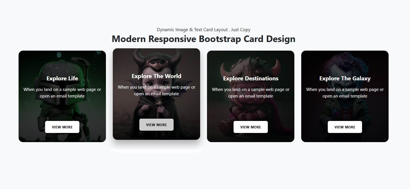
Key Elements of a Modern Bootstrap Card

A modern Bootstrap card design focuses on simplicity, performance, and user experience. Common elements include:

Card Header: Titles or categories

Card Body: Main content, text, or descriptions

Images or Icons: Visual representation of content

Call-to-Action Buttons: “Read More,” “Buy Now,” or “Contact Us”

Hover Effects: Smooth transitions for better interaction

Using rounded corners, subtle shadows, and consistent spacing creates a professional and contemporary look.

Best Practices for Responsive Card Design

To create an effective and modern responsive Bootstrap card design, follow these best practices:

Use Bootstrap’s grid system (col-md, col-lg) for layout control

Maintain consistent padding and margins

Optimize images for faster loading

Use CSS hover effects sparingly

Ensure text readability on all devices

Keep card content concise and meaningful

These practices help improve performance, accessibility, and user retention.

Use Cases of Bootstrap Card Design

Bootstrap cards are widely used across different industries and websites:

Real Estate Listings: Property details and pricing

E-commerce Products: Product images and CTA buttons

Blog Layouts: Article previews and featured posts

Business Websites: Services and features showcase

Dashboards: Data summaries and statistics

Their flexibility makes them suitable for both simple and complex UI designs.

Future of Bootstrap Card Design

As UI/UX trends evolve, Bootstrap cards are becoming more interactive with animations, gradient backgrounds, and icon-based layouts. Combined with frameworks like React or Vue, modern Bootstrap card designs continue to remain relevant for fast, responsive, and scalable web development.

Conclusion

A modern responsive Bootstrap card design is an essential component of contemporary web design. It enhances user experience, improves visual appeal, and ensures responsiveness across devices. Whether you are building a business website, blog, or product showcase, Bootstrap cards provide a reliable and stylish solution for presenting content effectively.

HTML

<!doctype html>
<html lang="en">
<head>
<meta charset="utf-8">
<meta name="viewport" content="width=device-width, initial-scale=1">
<title>CKD | Modern Popular Responsive Bootstrap Card Design</title>
<link href="https://cdn.jsdelivr.net/npm/bootstrap@5.3.2/dist/css/bootstrap.min.css" rel="stylesheet">
<link href="https://fonts.googleapis.com/css2?family=Cardo:ital@1&family=Rubik:wght@400;700&display=swap" rel="stylesheet">
<link rel="stylesheet" type="text/css" href="css/style.css">
</head>
<body>
<section class="py-4 bg-light">
<div class="pb-3 text-center">
 <p class="fw-normal mb-0">CKD | Dynamic Image & Text Card Layout . Just Copy</p>
 <h2 class="fw-bolder">CKD \ Modern Responsive Bootstrap Card Design</h2>
</div>
<div class="container">
 <div class="row g-4">
   <div class="col-lg-3 col-md-4 col-sm-6 col-12 shadow-sm">
     <div class="ckd_card" alt="image not found" data-img="image/1.jpg">
       <div class="bg bg-back"></div>
       <div class="card-content-ckd ck">
         <h2 class="card-title-ckd">Explore The Life.</h2>
         <p class="card-text-ckd">The Dammy Content we have for showing how content show it's just text</p>
         <button class="btn btn-custom-ckd">View Now</button>
       </div>
     </div>
   </div>
   <div class="col-lg-3 col-md-4 col-sm-6 col-12 shadow-sm">
     <div class="ckd_card" alt="image not found" data-img="image/2.jpg">
       <div class="bg bg-back"></div>
       <div class="card-content-ckd ck">
         <h2 class="card-title-ckd">The World Antic.</h2>
         <p class="card-text-ckd">The Dammy Content we have for showing how content show it's just text</p>
         <button class="btn btn-custom-ckd">View Now</button>
       </div>
     </div>
   </div>
   <div class="col-lg-3 col-md-4 col-sm-6 col-12 shadow-sm">
     <div class="ckd_card" alt="image not found" data-img="image/3.jpg">
       <div class="bg bg-back"></div>
       <div class="card-content-ckd ck">
         <h2 class="card-title-ckd">Explore Destinations New World.</h2>
         <p class="card-text-ckd">The Dammy Content we have for showing how content show it's just text</p>
         <button class="btn btn-custom-ckd">View Now</button>
       </div>
     </div>
   </div>
   <div class="col-lg-3 col-md-4 col-sm-6 col-12 shadow-sm">
     <div class="ckd_card" alt="image not found" data-img="image/4.jpg">
       <div class="bg bg-back"></div>
       <div class="card-content-ckd ck">
         <h2 class="card-title-ckd">Explore Our Galaxy.</h2>
         <p class="card-text-ckd">The Dammy Content we have for showing how content show it's just text</p>
         <button class="btn btn-custom-ckd">View Now</button>
       </div>
     </div>
   </div>

</div>
</div>
</section>
<script src="js/js.js"></script>
<script src="https://cdn.jsdelivr.net/npm/bootstrap@5.3.2/dist/js/bootstrap.bundle.min.js"></script>
</body>
</html>

CSS

<style>

.ckd_card { position: relative; display: flex; align-items: flex-end; overflow: hidden;  height: 325px; text-align: center; color: #ffffff; border-radius: 1.2rem;  cursor: pointer; transition: transform 0.5s cubic-bezier(0.19,1,0.22,2), box-shadow 0.5s cubic-bezier(0.19,1,0.22,2); } .ckd_card .bg {  position: absolute; top: 0; left: 0; width: 100%; height: 100%;  background-size: cover; background-position: center; transition: transform 1s ease, filter 1s ease;  z-index: 0; filter: brightness(0.4); } .ckd_card::after {  content: ""; position: absolute; top: 0; left: 0; width: 100%; height: 100%;  background: linear-gradient(to top, rgba(0,0,0,0.6), transparent 60%); z-index: 1; } .card-content-ckd { position: relative; z-index: 2; display: flex; flex-direction: column; align-items: center; width: 100%; padding: 1rem; transition: transform 0.7s cubic-bezier(0.19,1,0.22,1);margin-bottom: 1em;} .card-content-ckd > * + * { margin-top: .5rem; } .card-title-ckd { font-size: 20px; font-weight: bold; line-height: 1.2; } .card-text-ckd { font-size: 15px; min-height: 82px;} .btn-custom-ckd {  margin-top: 1.5rem; padding: 0.75rem 1.5rem; font-size: 0.75rem; font-weight: bold;  letter-spacing: 0.025rem; text-transform: uppercase; color: #000; background-color: #fff;  border: none; transition: all 0.5s; } .ckd_card:hover .btn-custom-ckd { background-color: #ccc; color: #000; font-size: 0.75rem; } @media (hover: hover) and (min-width: 600px) {  .ckd_card:hover { transform: translateY(-8px); box-shadow: 0 15px 25px rgba(0,0,0,0.3);}  .ckd_card:hover .bg { transform: scale(1.1) rotate(2deg); filter: brightness(0.8);}  .ckd_card:hover .card-content-ckd { transform: translateY(0);} } @media  only screen and (max-width: 767px){ .ckd_card:hover { transform: translateY(-8px); box-shadow: 0 15px 25px rgba(0,0,0,0.3);}  .card-title-ckd {font-size: 26px;} }

</style>

JavaScript

<script>

document.querySelectorAll('.ckd_card').forEach(card => {  const khuch_bhi = card.querySelector('.bg');  khuch_bhi.style.backgroundImage = `url('${card.dataset.img}')`; });

</script>