
Responsive Footer Bootstrap 5 in (2025–2026): Best Practices & Modern Design Guide
In modern web development, a footer is no longer just a copyright section—it’s a vital part of user experience, navigation, branding, and SEO. With the continued popularity of Bootstrap 5 in 2025–2026, creating a responsive footer that looks great on all devices has become easier, faster, and more efficient.
This blog explores how to design a fully responsive footer using Bootstrap 5, highlights modern trends, and explains best practices you should follow in 2025–2026.
Why a Responsive Footer Matters in 2025–2026
As mobile-first indexing and user experience continue to dominate search engine algorithms, responsive footers are essential. A well-structured footer:
Improves website navigation
Enhances mobile usability
Boosts SEO with internal linking
Builds trust using contact and social links
Supports accessibility standards (WCAG)
Bootstrap 5 provides a flexible grid system and utility classes that make footer responsiveness effortless.
Key Features of Bootstrap 5 Footer
Bootstrap 5 has evolved with performance and flexibility in mind. When designing a footer in 2025–2026, these features stand out:
1. Mobile-First Grid System
Bootstrap 5 uses a flexbox-based grid that adapts perfectly across devices—mobile, tablet, laptop, and desktop.
2. Utility-First Classes
Spacing, alignment, and visibility are handled using utility classes like:
d-flex
justify-content-between
text-center text-md-start
py-4, mt-5
This reduces the need for custom CSS.
3. No jQuery Dependency
Bootstrap 5 completely removed jQuery, making footers lighter, faster, and more compatible with modern JavaScript frameworks.
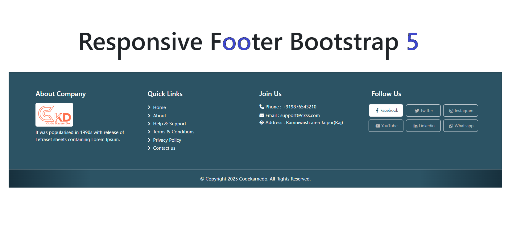
Essential Footer Sections for Modern Websites
A responsive footer in 2025–2026 should include the following components:
Company or Brand Info
Brief introduction, logo, or tagline that reinforces branding.
Quick Navigation Links
Important internal pages like:
About Us
Services
Blog
Contact
Contact Information
Phone number, email, and location increase credibility and trust.
Social Media Icons
Links to Instagram, LinkedIn, Facebook, GitHub, or X (Twitter) improve engagement.
Newsletter or CTA (Optional)
Email subscriptions or call-to-action buttons help in lead generation.
Best Practices for Responsive Footer Design
Follow these tips to create a future-proof Bootstrap 5 footer:
Use container or container-fluid wisely
Stack columns vertically on small screens
Use semantic HTML (<footer>, <nav>)
Ensure contrast for accessibility
Optimize links for SEO (descriptive anchor text)
Avoid overcrowding the footer area
Bootstrap 5 Footer Design Trends (2025–2026)
Web design trends are evolving, and footers are no exception:
Minimalist layouts
Dark mode footers
Gradient backgrounds
Animated hover effects
Icon-based navigation
AI-powered chat or support links
These trends make footers more interactive and visually appealing without compromising performance.
SEO Benefits of a Well-Structured Footer
A properly optimized footer can significantly improve SEO:
Strengthens internal linking structure
Reduces bounce rate
Helps search engines crawl important pages
Enhances user experience signals
Improves local SEO with address details
Bootstrap 5 makes it easy to structure clean, crawlable HTML—perfect for SEO in 2025–2026.
Conclusion
A responsive footer using Bootstrap 5 is a must-have element for modern websites in 2025–2026. With its mobile-first grid, utility classes, and performance improvements, Bootstrap 5 allows developers to build clean, fast, and SEO-friendly footers with minimal effort.
By following best practices and modern design trends, you can create a footer that not only looks great but also boosts engagement, usability, and search rankings.