
Responsive Header (Navbar) Using Custom HTML, CSS & JavaScript
Introduction
In modern web design, a responsive header (navbar) is one of the most important UI components. It helps users navigate your website easily on desktops, tablets, and mobile devices. A well-designed responsive navbar improves user experience, reduces bounce rate, and enhances overall website performance.
In this blog, we will explore how to create a responsive header (navbar) using custom HTML, CSS, and JavaScript without relying on heavy frameworks. This approach keeps your website lightweight, fast, and fully customizable.
What Is a Responsive Navbar?
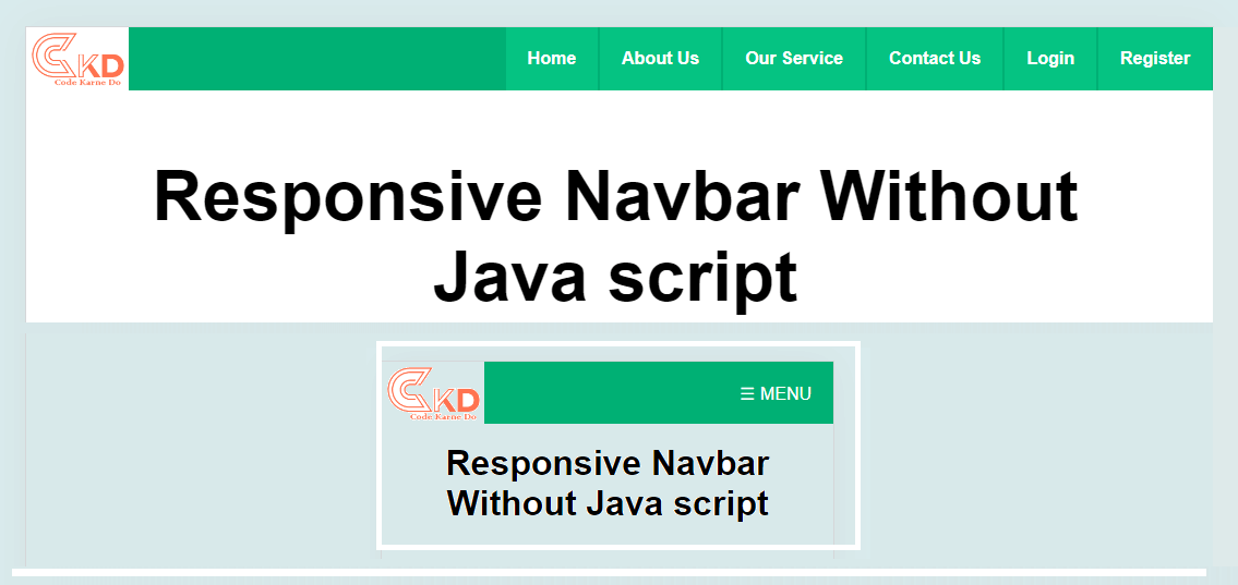
A responsive navbar automatically adapts to different screen sizes. On large screens, it displays menu items horizontally, while on smaller screens, it transforms into a mobile-friendly hamburger menu.
Key benefits include:
Better mobile usability
Clean and professional layout
Improved SEO and accessibility
Faster loading speed
Why Use Custom HTML, CSS & JavaScript?
Using custom code gives you full control over design and functionality.
Advantages:
No dependency on external libraries
Easy customization
Optimized performance
Better understanding of core web technologies
Custom navbars are ideal for developers who want flexibility and originality in their UI components.
Basic Structure of a Responsive Header
A responsive navbar usually consists of:
Logo or brand name
Navigation links
Hamburger icon for mobile view
HTML handles structure, CSS manages layout and responsiveness, and JavaScript controls interactive behavior like toggling the menu.
Designing the Navbar with CSS
CSS plays a major role in responsiveness:
Flexbox is used for horizontal alignment
Media queries adjust layout for different screen sizes
Smooth transitions enhance visual appeal
Using CSS media queries, the navigation menu can switch from desktop view to mobile view seamlessly.
Adding Interactivity with JavaScript
JavaScript enables dynamic behavior:
Toggle menu on hamburger click
Add active classes for animations
Improve accessibility with keyboard support
This ensures your navbar is not just responsive but also interactive and user-friendly.
Best Practices for Responsive Navigation
To build a professional responsive navbar, follow these tips:
Keep navigation simple and minimal
Use clear and readable fonts
Ensure touch-friendly buttons for mobile users
Optimize for accessibility (ARIA labels)
Test on multiple devices and screen sizes
SEO Benefits of a Responsive Navbar
Search engines prefer mobile-friendly websites. A responsive header helps in:
Better crawlability
Improved user engagement
Lower bounce rates
Higher search rankings
Google’s mobile-first indexing makes responsive design essential for SEO success.
Conclusion
A responsive header (navbar) using custom HTML, CSS, and JavaScript is a must-have feature for modern websites. It enhances user experience, improves SEO, and gives your site a professional look across all devices. By avoiding frameworks and writing clean custom code, you ensure better performance and complete design flexibility.
Whether you are building a portfolio, business website, or blog, implementing a responsive navbar is a smart and future-ready decision.