
Scrolling in Sticky-Top for Blog Navbar, Inner Blog & Footer (Bootstrap 4.1.3)
In modern blog websites, smooth scrolling and sticky navigation play a crucial role in enhancing user experience. A sticky-top navbar allows readers to navigate between blog sections effortlessly while scrolling. When combined with inner blog scrolling and a well-structured footer, it creates a clean and professional layout.
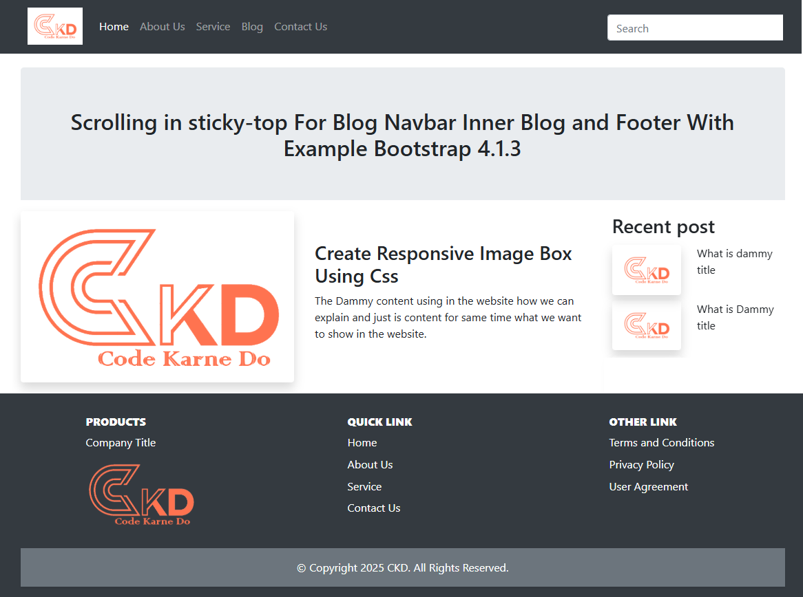
In this blog, we will explain how to implement scrolling with sticky-top for a blog navbar, inner blog sections, and footer using Bootstrap 4.1.3, along with a practical working example.
What Is Sticky-Top in Bootstrap 4.1.3?
Bootstrap 4.1.3 provides a utility class called sticky-top.
It keeps an element fixed at the top of the viewport once it reaches that position while scrolling.
Benefits of Sticky-Top Navigation
Improves content accessibility
Enhances user engagement
Ideal for long blog posts
Works without custom JavaScript
Use Case: Blog Navbar with Inner Page Scrolling
In a blog layout:
The navbar stays visible while scrolling
Clicking menu links smoothly scrolls to blog sections
The footer appears naturally after content ends
This setup is especially useful for long-form articles, documentation blogs, and tutorial websites.
Important Notes for Bootstrap 4.1.3
sticky-top works best when parent elements do not have overflow hidden
Add padding-top to sections to prevent overlap
Compatible with modern browsers
No JavaScript required
SEO & Performance Benefits
Using sticky navigation improves:
Time on page
Content discoverability
Mobile usability
Overall blog engagement
Search engines also favor well-structured internal navigation, which helps in better indexing.
Conclusion
Implementing scrolling with sticky-top for blog navbar, inner blog content, and footer using Bootstrap 4.1.3 is simple and highly effective. It enhances user experience, improves readability, and adds a professional touch to your blog design.
This method is perfect for technical blogs, tutorials, and long-content websites.